Copywriting is both extremely public and quite personal.
Your website supports private goals about your business, who YOU want to serve, and what you want to do for them. Yet it’s also your public face to the world.
Copywriting sessions with me begin with a probing discussion of what you want, and then of what your client wants. We make sure your site serves both!
Before-and-after screenshots don’t capture the deep work that’s done – but they do show the results.
Here’s a taste of how a site might change.
(Used with permission. Use your browser zoom tool to take a closer look.)
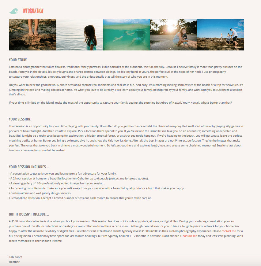
Example #1:
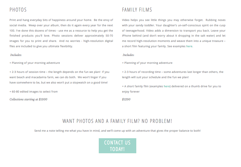
A family photographer serving two distinct groups of clients.
- This photographer has two groups of clients – vacationers, and people who live locally. This page didn’t address their separate needs, and spoke mostly to vacationers. The imbalance was reflected in her inquiries, which was a constant source of frustration.
- The page didn’t show off her strengths – she knows every inch of the islands and can match every family to a specific activity that they would LOVE. She knows all the secret places tourists can’t find. If a family has toddlers, she knows the right beach for them with no scary waves. If they are sick of beach time, she knows all the good macadamia farms. This didn’t express how good of a resource she is!
- Her vacation clients’ biggest concern is that photos would be a stressful, high-obligation thing that would take away from the “fun” of vacation. This page didn’t show how a photo session really is just one more adventure tailored to them, not a tack-on to the “fun time.”
- The page was a large wall of text, which always encourages people to skim.
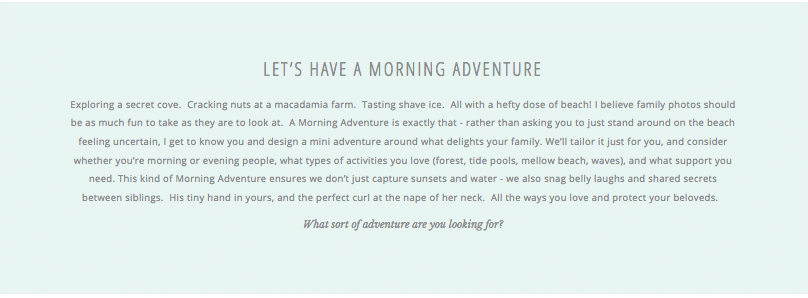
To address her client’s biggest concern, we re-framed her photo sessions as “Morning Adventures” – which is more accurate. We gave enticing examples of what this could be, but focused on her ability to find exactly what they need (she is “a photographer with a teensy bit of travel agent thrown in.”)
To entice her two separate groups of clients, we did side-by-side paragraphs that spoke to them individually. Each paragraph describes their experience, what they’re currently thinking, eases their worries, and highlights aspects of her services best built for them.
We chose concern-calming testimonials to include, shoring up her points about the session being organic, fun, and not an interruption of a trip.
We clarified her offerings (that had been stressing her out) by doing another side-by side paragraph explaining her options of film and photography. Her site before didn’t have any film options, and she didn’t know how to present this package option without complicating everything. We came up with a simple structure for how to offer it and presented it clearly, with a call-to-action button.
Lastly, we planted seeds for product sales with a brief slideshow at the end, showing off her albums in people’s hands.
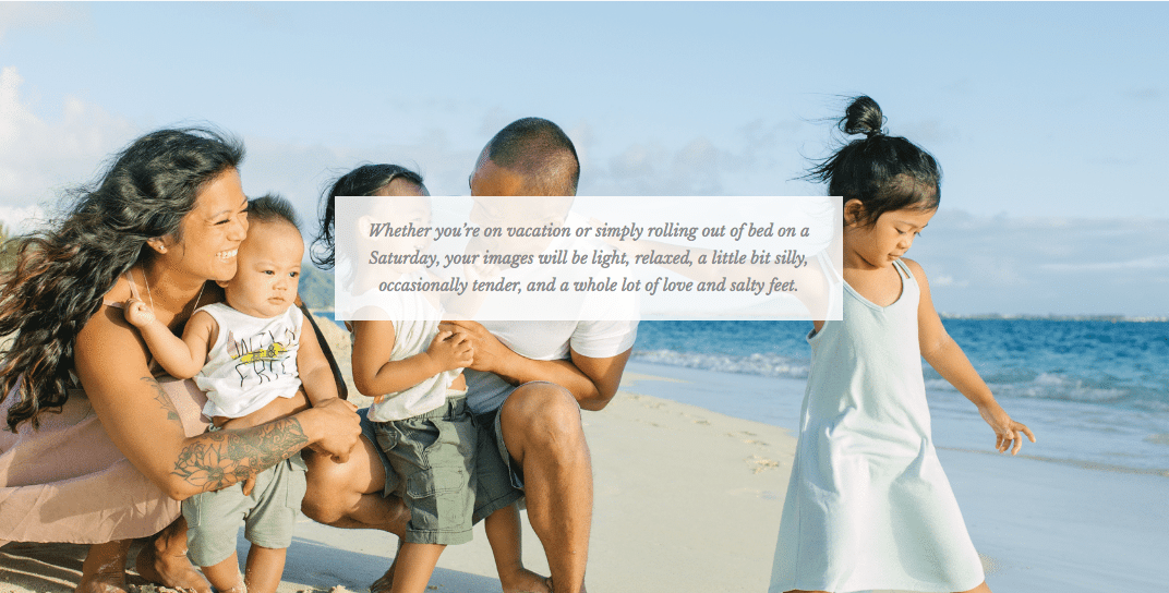
Whereas before her info page was an overwhelming wall of text that didn’t do her skills or services justice, this new page entices clients with a unique offer, addresses different clients and packages beautifully and cleanly.


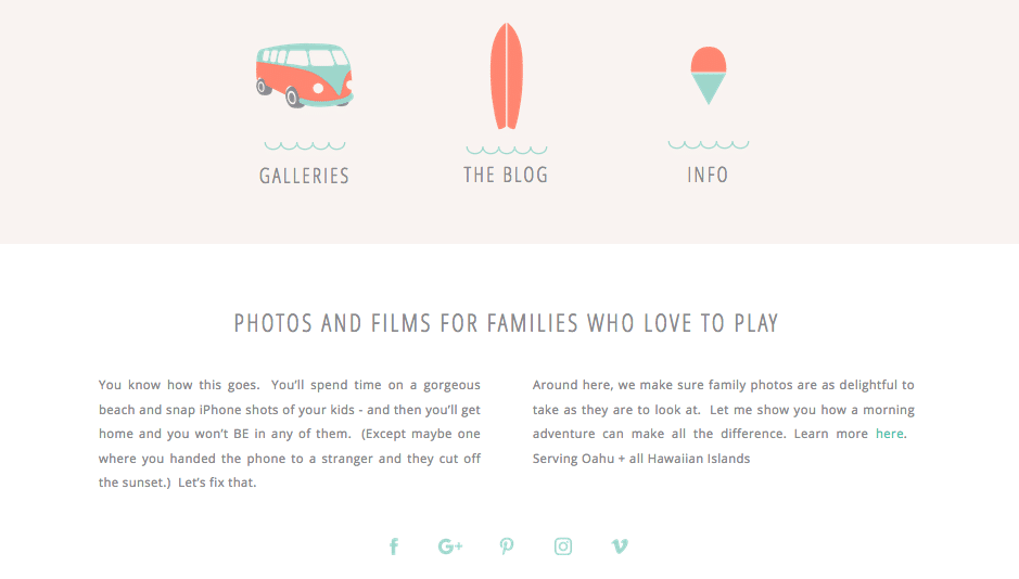
Part of Home Page, After:
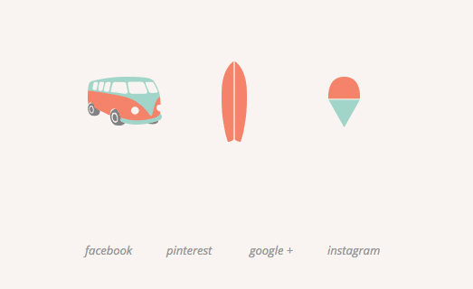
The cute icons now have labels, so navigation is simple.
A short tagline now tells clients what she does and whether they’re in the right place (“Photos and Films for Families Who Love To Play”).
A brief blurb speaks in language her clients actually use, already addressing some concerns they have (“this will be boring / I don’t have time for this on vacation / but I hate it when I have no good family pics from an expensive trip”).
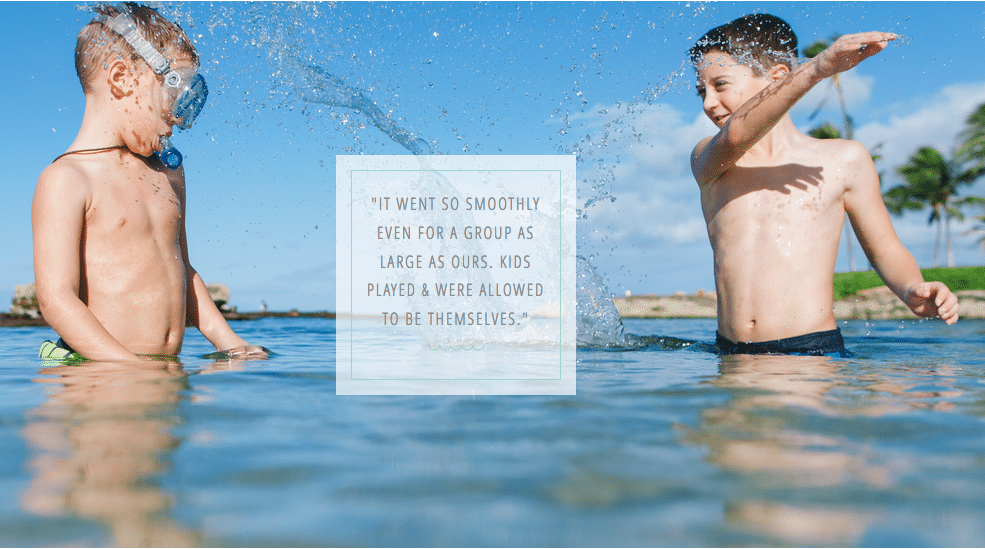
Her new design is scroll-friendly. So below the blurb, there’s a testimonial that subtly addresses her clients’ biggest concern (that photos are a ‘separate activity’ they won’t have time for, rather than an organic experience that is fun in and of itself). A quick video shows her family films and the vibe of a session.
What this photographer had to say 8 months after working with me:
“I have more qualified inquiries and more of those inquiries book. And more importantly, I’m attracting playful families who want to jump in the water. Originally, I thought I would have to expand on what I was doing to attract the right client, but you helped me realize I was already providing a service that I wasn’t fully explaining in my copy. I feel very fortunate.”
Want to book your copywriting session?
Email jenika@psychologyforphotographers.com
Need another example? No problem!
Example #2:
A husband and wife team, photographing both weddings and family portraits.
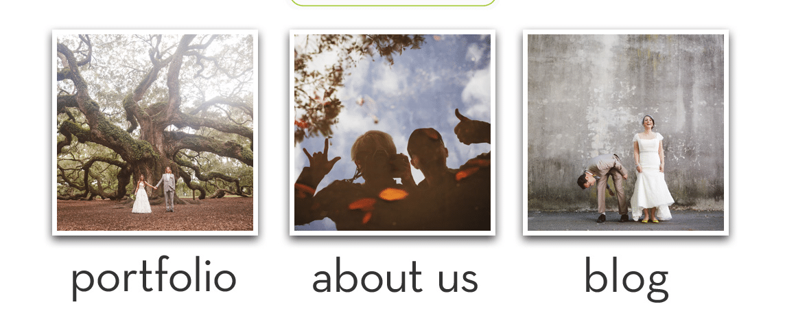
1. Splash Page, Before:
They had a certain website structure they needed to keep. The original splash page showed beautiful wedding/couple images, but family portrait clients would not immediately see what they offered them.
The three choices given were also only 3 of 6 eventual navigation options, and the options weren’t overly strategic about where to send people first.
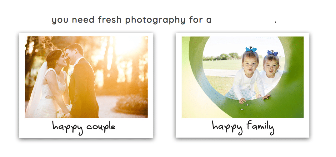
Splash Page, After:
Their original site was mostly focused on weddings (and that imbalance was also reflected in their eventual inquiries).
Now when clients come, they pick which “door” they want to enter, and then only see what information is relevant to them. There is no crossover in what they’re currently searching for, so they never see distracting info.

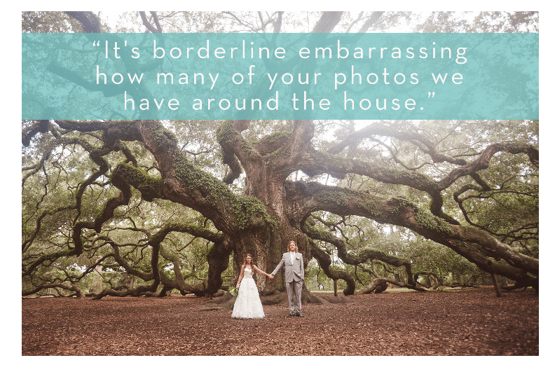
Welcome Gallery, After:
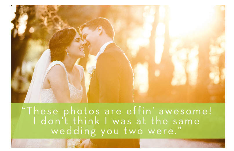
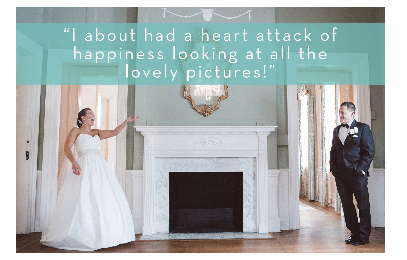
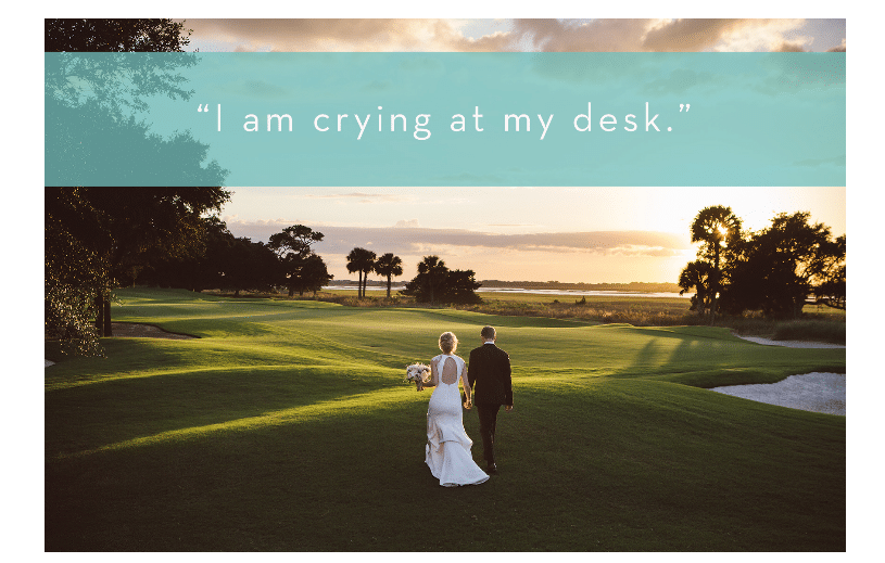
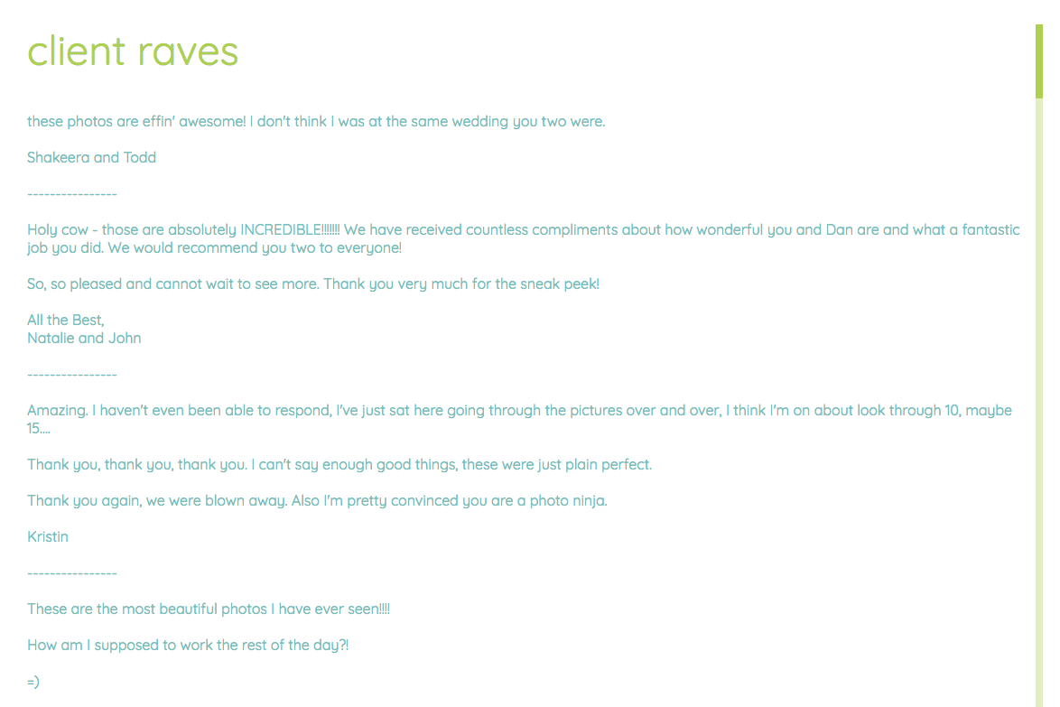
We combed through their testimonials and overlaid a few one-liners that showed off client enthusiasm for what they received, but also had a great sense of humor and delight. This shows what both the photographers and the clients value – and speaks immediately to the right kind of person.

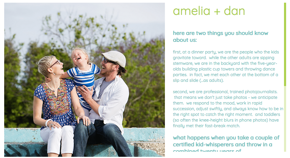
About Page, After:
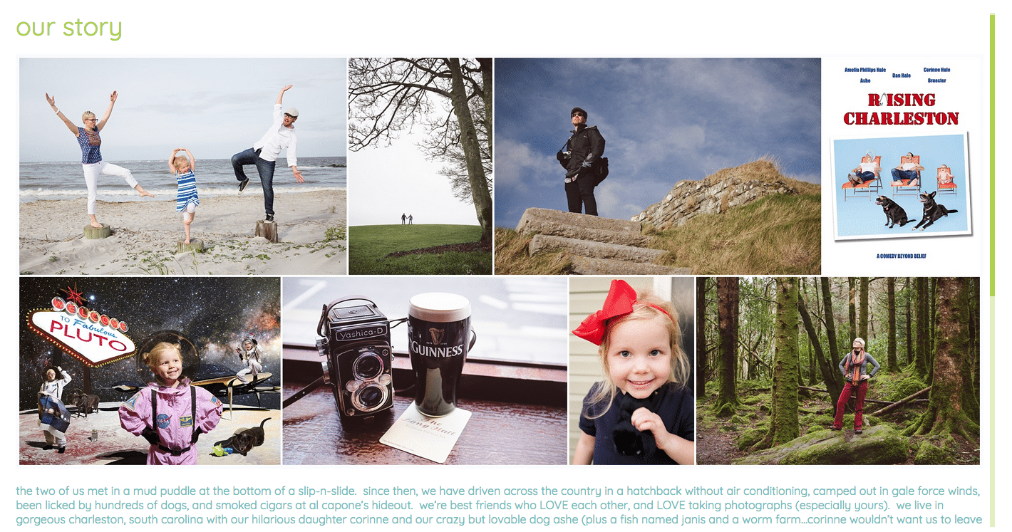
About Page, After, continued:
Remember how we split their site into two sub-sites?
This gave us a chance to write a separate About page for the portrait side that focused on who they are as parents and kid-whisperers, and gave connection points more relevant to that audience.
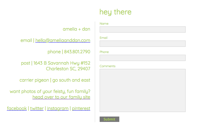
Their old page had some funny notes that showed off their personality. But it was text only – no form. Making it harder for people to reach them!
When I asked this client if I could use their site for this example, they replied with an enthusiastic yes, because “We would love for more people to benefit from your services.”