The Blog Library
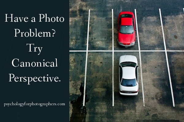
Have a Photo Problem? Try Canonical Perspective.
Quick, before you scroll down – grab a piece of paper and sketch a cup of tea.
It’s OK if you’re not “good” at drawing, no one will see this. It only takes a few lines.
Go on, try it. I’ll wait.
….
Got it? OK, scroll down to read the rest:

When researchers had people all over the world do this, most folks drew something like this:
That is, in terms of perspective, they drew the teacup from the side and slightly above the object. (How does yours compare?)
Interestingly, no one drew the teacup looking straight down:
But why not? After all, that’s similar to the view you see when looking down at it on your kitchen counter while you rifle through the mail.
Similarly, very few people drew the teacup from a straight-on side view:

Most people, worldwide, drew it from the side with (roughly) a 30-45 degree tilt so you could see a bit of the top.
This “to the side and slightly above” view is known as canonical perspective.

We tend to recognize all sorts of objects better when they are presented to us in canonical perspective.
Even small animals like dogs and cats, who we often see from much higher above than 30-45 degrees, or animals like horses, who we don’t usually encounter from a slightly higher angle. We still “like” seeing them in canonical perspective. There’s also some evidence that when we imagine objects, we imagine them with canonical perspective.
There are some exceptions to this rule, but it’s interesting for photographers to think about. It helps make pleasing images because it goes along with how we “like” to think about objects.
Most of us probably photograph objects using the canonical perspective “rule,” whether we’re explicitly aware of it as a rule or not.
Same with the “rule of thirds” – many of us intuitively composed photographs that way before we explicitly knew about it, but it’s still a helpful guideline to think about when we’re stuck.
As I go back and look through my own work, understanding canonical perspective helps explain why some shots “worked” and some shots didn’t quite land the way I hoped.
For example, taking some shots of lunch at Les Halle awhile back, this snapshot of my chocolate mousse didn’t quite work as well as I wanted it to – you can tell what it is, but it’s a little disorienting:

It does the job, but the angle is a little too high, and I think the shot could have been improved by lowering my camera.
By contrast, I think this snap of my lemon water was more pleasing to the eye:

That’s pretty much textbook canonical perspective.
As I scroll through snapshots on my personal Facebook mini-feed, I see that many “amateur” snapshots look amateurish simply because they violate canonical perspective. When people want to take a quick snap to show off their date night dinner, often times people will photograph straight down on their plate, when it would have looked more appetizing if they had gone to the side and slightly above.
Photos of all sorts of things – sewing projects, new outifts, furniture, puppies, even babies – are often taken from high above or a straight-on side view, and frequently the shot could have been improved by understanding this “to the side and slightly above” rule.
Canonical perspective neatly lines up with how the human mind likes to picture things.
Not all of our casual snapshots need to be masterpieces, but it’s amazing what small changes of camera angle can achieve.
Of course, “rules” are made to be broken.
If we imagine objects from the side and slightly above, then breaking that rule can have interesting, startling, eye-catching effects. Shooting from far higher above may reveal new or curious patterns, things we don’t typically see in everyday life or take time to imagine.

Or rotating things to a new angle can make things appear surreal, like this cool shot.
Not all perspective problems are solved by canonical perspective. And, like the rule of thirds, not all shots should be taken that way (boring!).
But I’ve found this tidbit of visual cognition exceedingly useful ever since I read about it from Susan Weinschenk, a psychologist who writes extensively about making technology more useable. One thing she advises web designers to do is to create icons from this perspective to make them easier to recognize and more pleasing to the eye. Fascinating!

Just for fun: Go back through and look at the last time you shot objects, products, or other “stuff.”
See whether any “missed” shots seem off, at least in part, due to a violation of canonical perspective.
And next time you’re struggling to get just the right angle during a shoot, consider the “to the side and above 30-45 degrees” – it may give you a useful place to start.
Once you know about this idea, you start seeing it everywhere.


I love this! My simple drawing was exactly like the first one. I’m teaching a photography class to some middle school students this winter. I am going to do this with them on Friday.
Thanks for another great post.
Awesome, Jennifer! 🙂
Super cool and very thoughtful. I’d never heard this before but can already identify canonical violations in some of my failed photos. Excited to try it with future shots!
This is a really interesting perspective (no pun intended). I don’t know if I ever realized that angle was so pleasing to the eye. Very cool!
So, I drew the cup, scrolled down, found that mine matched yours and was momentarily elated, overcome with that sense of belonging to an exclusive club – and then I read about all the other millions of members who had found there way through the door. Bummer.
The next little downer was my questioning why these other perspectives from which to draw the cup never so much as occurred to me. Now I felt ‘other’ of a different sort. All this and I haven’t really gotten to the story yet. I’m cool. I’m not so cool, plain ordinary really. I am creatively clueless. Phew! That’s a lot to go through in 20 seconds or so.
Good info Jenika! I’ve always thought that the principle difference between a snap shot and a photograph – post processing prissiness aside – is perspective. And I did what you did – skipped back through a few shots and discovered that I had more or less ranked them that way during the post shoot triage exercise. So when I read an article like this I get to feel so, I don’t know, validated?
People are amused at the number of shots I go through (that we all go through) on any given project – they wonder why. My answer in past has been ‘because that’s how many it takes.’ I think from now on it’ll be ‘because I was not far enough up and to the right.’ That’s almost guaranteed to send them mumbling into the night.
Thanks!
Haha, thanks for the awesome comment, Richard. Sorry to put you through so much in a few short sentences 😉 It’s cool that it matched, though, and that the principle is useful to you. It’s pretty simple, but simple ideas are often the most elegant, so I thought it worth sharing. It does take a lot of shots to get the one you want! Maybe we can take a handful fewer now….. 🙂
Very interesting article. Thanks for posting it.
I like the perspective taken on most of these articles where they challenge your way of thinking. People often go day to day not thinking about the little things, but it’s honestly those missed details that make the difference.
Great post!
Interestingly, I drew the teacup from the top down! I guess I like to break the rules! 😉
Rebel! 😉
Oh, you must have caught me on a creative day … I actually drew a cup filled with letter T’s peeking out and overflowing : )- I do like the psychology you presented about the angle of view. Thank you for you blog – it inspires me in so many ways!
haha, brilliant. thanks for your comment!
In many of your posts you tell us to make a contract for all clients. How should I make a contract? What do they look like? I don’t know where to start. Any help would be very appreciated:) Thanks, Kaylie
Thank you for the great post! My drawing was just like the first one:) I love photography and am looking into starting a business and really appreciate all of the info on your blog!
Another thought provoking post.
Right on, Jenika!! Thank you for this!!
Thanks for posting. This is great. I’ve been planning on doing a project/post that relates to this idea for awhile. It’s similar to isometric drawings and paintings as well as technical/architectural 3-D sketching. The idea is that we want to give as much information as possible to the viewer in order to fully describe the object. The tea cup seen from the top or bottom is flattened and we can’t necessarily tell that it has an inside and outside. The cononical/isometric approach allows us to see this information. It is said that the first use of this approach in art was in 60/70 CE with the painting of the Pompeii Amphitheater (http://classconnection.s3.amazonaws.com/169/flashcards/1457169/jpg/brawl_in_the_pompeii_amphitheater1334809913403.jpg)
Fascinating about Pompeii….thanks for sharing!
this is amazing, though im just 14 to get into all this. I love to read this. and my rough sketch of the cup was the same as the first picture. like amazing it is. 😀