The Blog Library
Is Your Design Holding You Back?
The stage lights shone so fiercely I couldn’t see the audience.
Every now and again, I’d pace in front of the projector and get that bright PowerPointed beam straight in the eye, and I’d scuttle to the side like a wounded crab. But public speaking doesn’t bother me.
At least it didn’t, until I reached That One Slide.
The slide that had the old Psychology for Photographers logo on it.

There was nothing wrong with it. But blown up to be six feet across, the pixels and mushy edges were showing. And suddenly, in front of this group of people, I became acutely aware that my little home-brewed brand wasn’t exactly what I wanted it to be. I’d created the logo in Photoshop a year prior (to be honest, I had to Google some extra instructions on how to use the Shape tool), and hadn’t touched it since.
There, in front of the audience, I wondered – maybe I should hire someone to create a better one.
But then I thought:
Well, the logo didn’t prevent me from getting on this stage to teach about psychology, did it?
Design is important. Design is beautiful. Design is FUN.
But design is not EVERYTHING.
We stress a lot about the designs of our sites. As well we should – design communicates our message and supports what we do. It’s a barometer of professionalism and put-togetheredness.
But frankly, Psychology for Photographers sported a half-baked brand I’d whipped up in my own Photoshop kitchen for a full 21 months. Don’t get me wrong, it was functional. The “look” was a bit sunken in the middle and burned around the edges, though. However, that didn’t prevent the blog from reaching an audience of thousands of photographers, getting featured and linked to by other industry blogs, or being honored by The Modern Tog as the #1 blog for photographers 2 years in a row.
As a direct result of this blog I’ve been published in books and magazines from the US to the UK to Sweden. I’ve been invited to speak on podcasts and in conferences and had the honor of sharing others’ platforms as a guest writer. Most importantly, amazing business owners like you have allowed me into your inboxes and your hearts.
I say this not to brag – I’m quite humbled and astonished by what Psychology for Photographers has become.
I say this because I want to clap my hands on your shoulders, look you straight in the eye, and say: Don’t ever let your logo or your design hold you back.
The P4P inbox sees regular emails from people saying all the great things they’re going to achieve “when I get a new logo” or “when I figure out how to change my background.”
Self-made design is one of the biggest reasons people stay sitting in Excuseville instead of going out and doing things.
Design is important, yes yes YES, but hear me out: You can still create something amazing, reach people, touch hearts, and support your family with what you’ve got right now.
If hiring a pro isn’t in the cards, still create the cleanest, most functional and lovely design you can. But don’t let whatever you feel you lack prevent you from creating the best content you can, and sharing it with the most people you can.
Wear what you’ve got with confidence, improve where you’re able, but don’t stick yourself in a box believing that success HAS to come with a $XXXX price tag.
Because you’ve been reading this blog anyway, even in all its mildly pixelated, burlap-y glory.

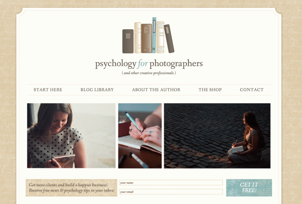
Now that we’ve covered that ground: You’ve probably noticed that things look a little different around here today.
(Are you reading this in your inbox? You’ve got to see this.)
About six months ago, I approached Michelle Cormack of A Girl Named Fred Design about the possibility of freshening this place up. And I didn’t mean just a coat of paint and a new entry rug. I wanted to rip out the carpets, smash the tile, and knock down a few walls. We scheduled the remodeling and went to work.
And whoa mama, when I walked in the front door of the new P4P home, I nearly fell over. (Good thing I was actually sitting in a desk chair at the time.)
Another cool thing: This design was directly funded by P4P readers. Last December, I held an email-list-only flash sale for Irresistible Website, and the proceeds went directly to spruce this place up. A hearty thank you to everyone who invested in their own websites and this one as well. And a hundred high-fives to Spencer Lum of 5 West Studios and Ground Glass for creating most of the photographs of me you’ll find scattered throughout.
I hope you take a minute to take a look around. Feel free to open all the doors and peek under the bed, I don’t mind.

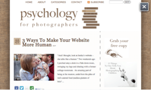
Even though I’m thrilled about the new chapter this design brings, I’ve still kept a little screenshot of the old place tucked away.
Not because I’m a sentimental pack rat (:: innocent face ::). But because I want to remember that if you focus on serving others, you can still build something beautiful, even if the outer dressing isn’t what you want it to be yet.
I’ve been blogging since 2005 (that’s 9 years – whew!), and this is the first time I’ve had a professional design. Focusing on writing and content has taken me far. (And I do mean far – once, a single essay landed me an 8-week all-expenses-paid trip to Tunisia.)
Which brings me to one last note:
Ever since I launched the Irresistible Website e-book, I’ve been flooded with emails saying that people are happy with their sites, but still feel that some of their writing or blogging isn’t serving their business.
In reply, this July I’ll be teaching a persuasive writing class for photographers, focusing on improving both blog and website writing. I’m throwing open my writing toolbox and giving away everything inside.
And it’s a pretty handy toolbox – with it, I’ve not only gained photography and education clients, but I’ve also coached others through a variety of writing situations (including successful Ivy League admissions essays, job and graduate school applications, grant requests, and more).
People have also hired me in the past to fill their websites and blogs with persuasive writing. But this time, I want to teach you exactly how to do it on your own.


LOVE the new look and LOVE you for being so open, honest, and genuine in what you share with us. I look forward to continuing with you on your (and my!) journey 🙂
The new design looks good.
I agree that design isn’t everything and that you should concentrate more on the actual content of your blog and website. Some people do get into that trap of worrying about the site design so much that they don’t get their content out there.
At the same time, your site design does needs to be functional at and allow people to find what they are looking for. If your site looks a mess, it’s a first impression that is hard to shake off, regardless of how good your content is.
Your old design was still stylish and gave a good impression – it just wasn’t suitable for expanding beyond the web.
Love the new look and feel! It feels even more comfortable in here. 🙂
Looks fab Jenika – congrats 🙂
Absolutely love the new design! It is beautiful! I can’t even tell you how much I want to join that writing class. It sounds like exactly what I need. Sadly, there is no way I can afford to do it right now. I hope that you’ll offer it again when my pockets are a little bit fuller!
In almost every Facebook forum I’m on, I read about people being stuck in fear of launching themselves because of this very thing.
Branding is important, yes. But so many people think that your brand is only your logo, your colors, your website background. Really, that’s the lipstick. Your brand is your work, your customer service, your ability to connect with clients. That takes no graphic design at all.
I’ve been there too. I went through 6 iterations of website designs in two years.
Congratulations! In our world, the accepted proof of sustained capability and stability is based on your corporate image. You’re earning your status and I hope you continue to do well.
thank you for sharing this insight. truly it is hard to create your own logo. you need to find the meaning and how is it relevant to your business