The Blog Library
Get Your Selling Point Across – Without Words

Know what the best words are, sometimes?
None at all.
Last week, we talked about how to take a paragraph from your site and slim it down. That was largely about removing non-contributing words and replacing them with livelier ones.
But sometimes I see a wall of words on a business website and think – they could take all of these out, and replace them with something different altogether.
And we have a brave volunteer to illustrate.
Charlotte Reeves does the kind of beautiful pet photography that makes me want to buy a pet and move to Australia, just so she could photograph my pet that I don’t even have right now.
When I emailed asking for website paragraph submissions, Charlotte was all “I volunteer as tribute!” (Okay no, she just wanted suggestions for shortening this paragraph from her home page):
“Our final destination is the presentation of some engaging, stunning and creative art of your best friend that portrays them perfectly. Your order is customised so you end up with what is important to you – whether that be a huge canvas of your best buddy’s infectious smile on the wall, a stunning wedding-style album to keep forever or a gorgeous luminous acrylic block to sit on your desk at work – allowing you to be constantly reminded of your pet’s story.”
So yes, we could shorten this with last week’s language advice. Option A.
OR:

Option B: We could also transform the paragraph into something like this –
–
Our final destination? You pick the perfect reminder of your pet’s story:
Whether on your wall, in your hands, on your work desk, or maybe all three – you’ll end up with exactly the piece of art that’s right for you! Let’s get started.
–
Tweak the words above and below as desired.
(NOTE: If you read that and your first thought was “But I don’t have any good product images right now…” – hang in there. I’m coming to you in a minute.)
First, let me applaud Charlotte for doing the smart thing:
Mentioning her final, actual products on her home page. If you’re a photographer, and all you ever show people are JPGs, do not be surprised when people fall in love with – and want to buy – JPGs.
Photos of your products jumpstart your sales process by helping clients vividly imagine owning what you’re actually selling. (Plus, it helps clear confusion early on – not everyone knows what an acrylic block is.)
I see many lengthy product description paragraphs on websites. Although sometimes they’re appropriate, I’d say 7 times out of 10, the prospective client (and you!) would be better served by seeing clear images of what you want them to buy.
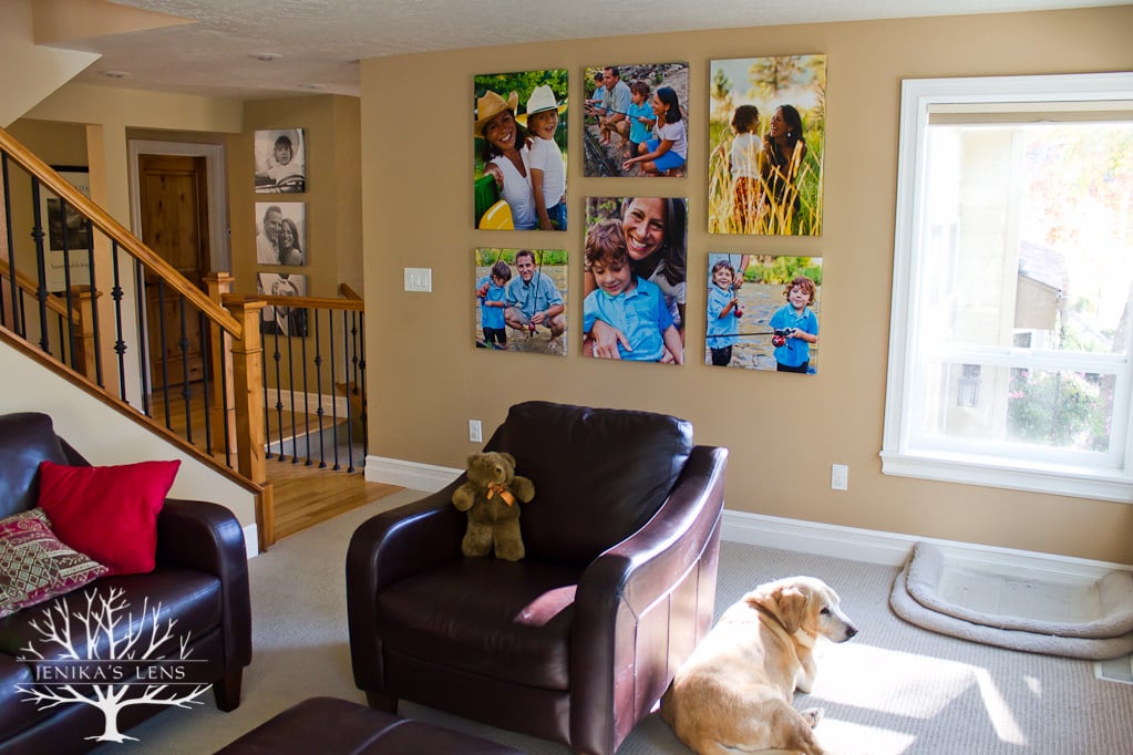
You can put brief descriptions underneath each image, if you wish – (think of it like a catalogue). If you need emotional richness, captions can do that.
That’s a sneaky trick, actually, when you absolutely need text: Use images to break up a longer paragraph into digestible captions.
 Captions are read 2-4x more often than body text, depending whose data you read. Because they’re read more often, using three images with three captions will probably get people to swallow the same number of words with less skimming.
But the image acts as a valuable visual landmark, an ideal selling tool, and a communication shortcut that lets people get on with the site.
This isn’t about cutting words because words aren’t important. It’s about helping people save their reading attention for the most critical things.
So if you can say it with an image or icon instead – consider doing that.
This applies to more than just products – have a three-step booking process? You could write a four-sentence paragraph describing it. Or you could have a phone icon, a calendar icon, and a camera icon – for Call, Schedule, and Enjoy Your Session (with captions as needed).
The faster people can absorb these details, the more you buy yourself attentional space to tell them how you’re unique.
(The practicalities of your booking process aren’t what set you apart.)
You probably have favorite websites to ogle (I have mine) that do a luscious job of showing products in real life situations, or that do a great job using graphics to break up text. Check them as needed for inspiration.
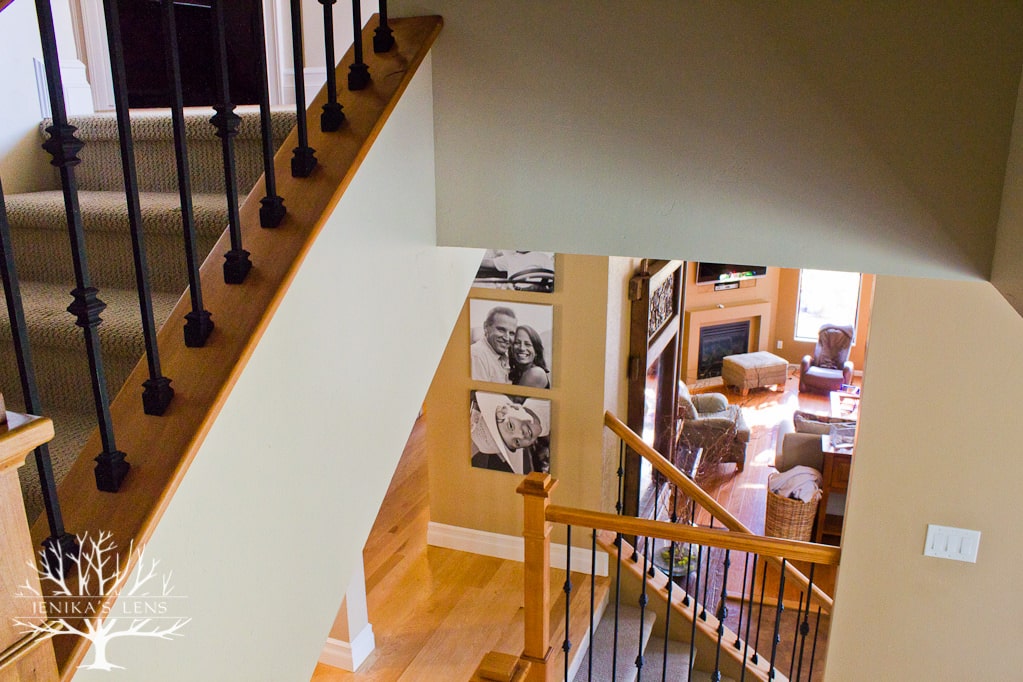
Now, what if you don’t have any photos of your products?
You can buy samples to photograph, which I would advise because you can also hand them to clients for added sensory selling. But if that’s not in the cards –
Here is how to get product photos without having to drop a ton of cash on samples:
1) Ask past local clients to come take pictures of their pictures. (Or your shop items, or whatever you sell.)
I know: You’ve thought about doing it. Here’s an email you can copy, paste and send right now:
Hey George! How are you doing? How is Marge? I hope this email finds you well.
Quick question: I find that some of my clients love the idea of getting photos printed, but they’re a little shy about actually taking action. Part of that is because they have a hard time actually picturing what the images will look like on their walls.
So I’m wondering – would you be willing to let me take a few photos of your [insert product here]? These photos would be quick to take, and would help me help others out.
I could simply swing by one afternoon, like xx/xx or xx/xx. No stress for you – the more ‘real life’ your house feels, the better. I’ll even bring you cookies/rice krispy treats/Lindor truffles for your trouble! Let me know if you might be willing to do this! Email back, or text me at xxx-xxx-xxxx.
Can you send that email today? I bet you can.
Just be sure to replace “George” and “Marge” with relevant names. Otherwise you’ll look weird, and it’ll be my fault.
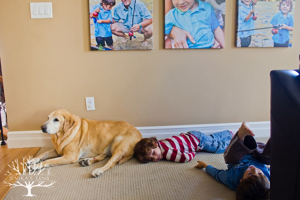
2) Conveniently, it’s almost Black Friday.
Pick the product you want photos of, email past clients and say you’re having a XX% sale, but three people can choose to double their savings by letting you come photograph their products. First come first served!
For example, “Canvases 25% off for everyone! And 3 lucky people can double their savings to 50% by placing their order and agreeing to let me come photograph the canvases in their home within 14 days of delivery. First come, first served on the double deal.”
Boom. Scarcity + a clear deadline = motivation.
(The exact deal percentages matter less…make sure you’re not losing money – the idea is someone else bears the cost, yet you both benefit.)
If you really want some specific people to buy – say, a client with a cool house, or someone whose photos you especially loved – just email those people a “limited, by invitation only” offer. Just make sure you put in scarcity + a deadline. It’s a flexible idea, adapt as needed.
So there you have it.
A quick way to cut a perhaps-unneded paragraph from your website, replace it with something that will probably sell people more, and preserve their attention for other things.
Plus two concrete ways to get it done.
Get on it!
P.S. Need more ideas about how to present your services?
Irresistible Words can tell you how to speak convincingly about your work (while sounding like a normal, kind human being)

Check it out here. Don’t forget to grab the free sample – I really still can’t believe I’m giving that tip away for free.
Irresistible Website gives you more creative ideas about how to present your work based on what your client is interested in.
Learn more here and download the sample chapter!



Great article, as usual, Jenika.
Just wanted to add that many photographers actually install their clients’ prints, thus providing the perfect opportunity to photograph their images onsite.
Yes! Absolutely true – you could make it a standard part of delivery (just asking permission beforehand) 🙂
Gosh, Jenika, you always make me think! I don’t know why this never occurred to me that an image is so much more powerful than words.
Follow up question, though. Some think that we need the words for SEO. Do you agree with that? How do you balance both?
Thanks so much for your insight!
Dawn
It’s a good question you ask, and balance is a good word, since there are so many factors that play into SEO I think it’s not good strategy to overly focus on any one. My answer has a couple layers. First, I’m not an SEO expert, but every time I’ve looked into the length issue, the only consensus seems to be that you should not fill a site with fluff to hit a perceived word count (the magic number estimate ranges from 300-1800 words anyway, and no one I know would suggest that you have 1000+ words on your home page). Nearly everyone says to optimize user experience. Most photographers end up with a lot of words on their site anyway, more than the average user will read, so this tip is to help get rid of the words you don’t need so that the words you DO use are read and appreciated. Cutting a single paragraph of 100 words on a site where there are already a few thousand seems unlikely to dramatically affect SEO but can dramatically affect reader experience. And since reader experience determines a lot of other aspects of SEO, I don’t really see this as an SEO tradeoff personally. At the very least, if you have 100 words that you don’t need, it’s STILL better to cut them and replace them with a more powerful 100 words, if you really do need/want them for SEO. So you can still cut the paragraph describing all your products and write instead about how a past client feels about having them in their home. The latter will sell more anyway.
Brilliant! Thanks for sharing.
Hope you can use it for something good, Vicki!
I love the idea of using BF sales to incentivize the client help with photos. That’s brilliant, and got my wheels turning.
Also, “I volunteer as tribute.” ???
It’s a convenient season to do if you really need someone to buy something, I think…just a thought. Hope it helps someone!
The question marks are actually laughing emoticons. Talk about miscommunication.
Hahaha.
Your posts are always unique and informative. Thank you so much for sharing such great info!! I shared this on the Rising Tide Society Facebook page.