The Blog Library
Why Do Some Images Stand Out Over Others? (Read Before Running Your Next Ad!)
You’ve got a fantastic promotion idea for your business. It came to you in a flash of genius, you scribbled out the marketing copy, and have the ad platform all queued up.
But when you go to design the ad….you simply cannot pick just one image.
You know you need to show off the dream aesthetic of your target client. A gaspworthy image that will make them wish they were in it, instead. One that whisks them away into I’m-Going-To-Look-So-Good-Land.
You’re also savvy. You know you need your promotion to show how you can solve a specific problem or eliminate an irritation for that client, and maybe the photo will help you do that.
(For example, instead of just a .jpg, maybe you’re going to select a picture of your work on canvas. A sort of picture-in-picture that shows off not just your work, but the item you actually want them to purchase).
Still – maybe there’s more than one image that fits the bill.
And it’s inherently hard to select from your own work, because each shoot is your baby. You can’t just CHOOSE a FAVORITE. Land sakes! That client…oh she was so hilarious! Oh, and the yummy light on that crack-of-dawn family session….you want people to see that too!
But warning!! Problems!! Danger!!

Alongside your ad, clients are going to be seeing dozens of other ads. Maybe it’ll be in a grid on a service listing site or directory. Nestled amongst the ads in a sidebar of your local popular mommy blogger. Or maybe it’ll just float awash in the endless offers of the Facebook mini-feed.
Unfortunately, even when you narrow it down to a set of images that appeal to your target client’s aspirations, fit with your promotion, and illustrate the kind of work you want to be attracting –
– that winning image might still get completely ignored in the noise of the shared ad space.
Gulp. Crap. There’s always a snag.
But there is something you can do.
When you want to choose a photo that is going to stand out over all others, the best place to start is to ask:
What is the human visual system designed to do best? What is in its nature to look at first?
Here are three fundamentals things you should know about human vision.
Understanding them may help you pick a standout ad faster than simply agonizing over whether you should go with the vintage tea party shot or the vintage picnic shot.
1) Pick the image that contrasts the surroundings.

What is the first concern of the human eye? As in, from a survival perspective?
Well, your eyes keep you from bumping into objects, walking into trees, and running off cliffs.
And you need to know where the tree ends or where the cliff begins. So our eyes are naturally attuned to looking for lines and boundaries between objects.
One of the ways it looks for these boundaries is that it looks for areas of contrast; both in color (e.g. the blue water against the brown sand) and luminance (e.g. the backlighting sun and the dark figures standing in front of it).
In fact, there’s something called the Mach effect, by which your eye actually exaggerates the contrast along a given boundary to help you see it even better. (This creates some funny optical illusions.) Your brain “wants” to see boundaries that help it parse and understand the world around you.
It’s no surprise, then, that strong lines and contrast tend to make an image noticeable.
This is one reason why leading lines, contrasting black and whites, framing, and repeating patterns tend to stand out.
Not only is your eye attuned to look for them, it’s also exaggerating those lines to make them stronger.
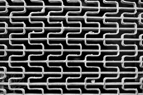
But even though repeating lines and patterns do draw the eye, “contrast” can be subtler than that.
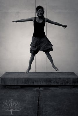
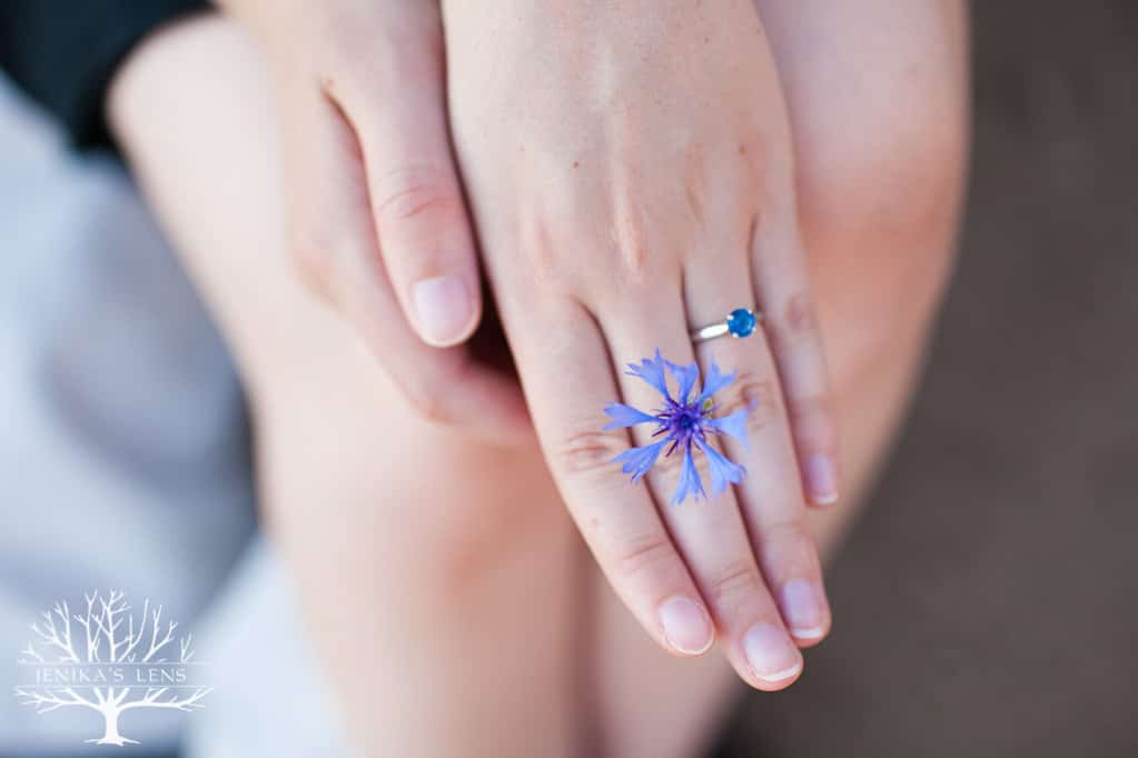
For example, look at the two images below.
The image on the left is less obviously contrasted than the one on the right. Additionally, in the one on the left, her face is not much different in luminance from the background.
In the one on the right, her face pops out from the background more. There are more obvious differences in color and luminance between face and background. Thus, it may stand out more in a busy advertising environment (particularly in one with a white screen background).
That doesn’t make the image on the left “bad,” just that in terms of low-level visual features, the one on the right will probably arrest someone’s attention a little more quickly as they scroll through a feed.

But wait!
The lesson here isn’t just that the image itself needs to have contrast.
The image also needs to contrast with its surroundings.
For example, if all of the other images on a page are dark, then when someone is scrolling through, a lighter image might stand out simply because it is the unusual “light” one. Likewise, a darker image may stand out in a bunch of lighter images.
So if you’re advertising on a page where everyone seems to have creamy, light-colored images, choosing a darker one may draw the skimming eye more quickly.
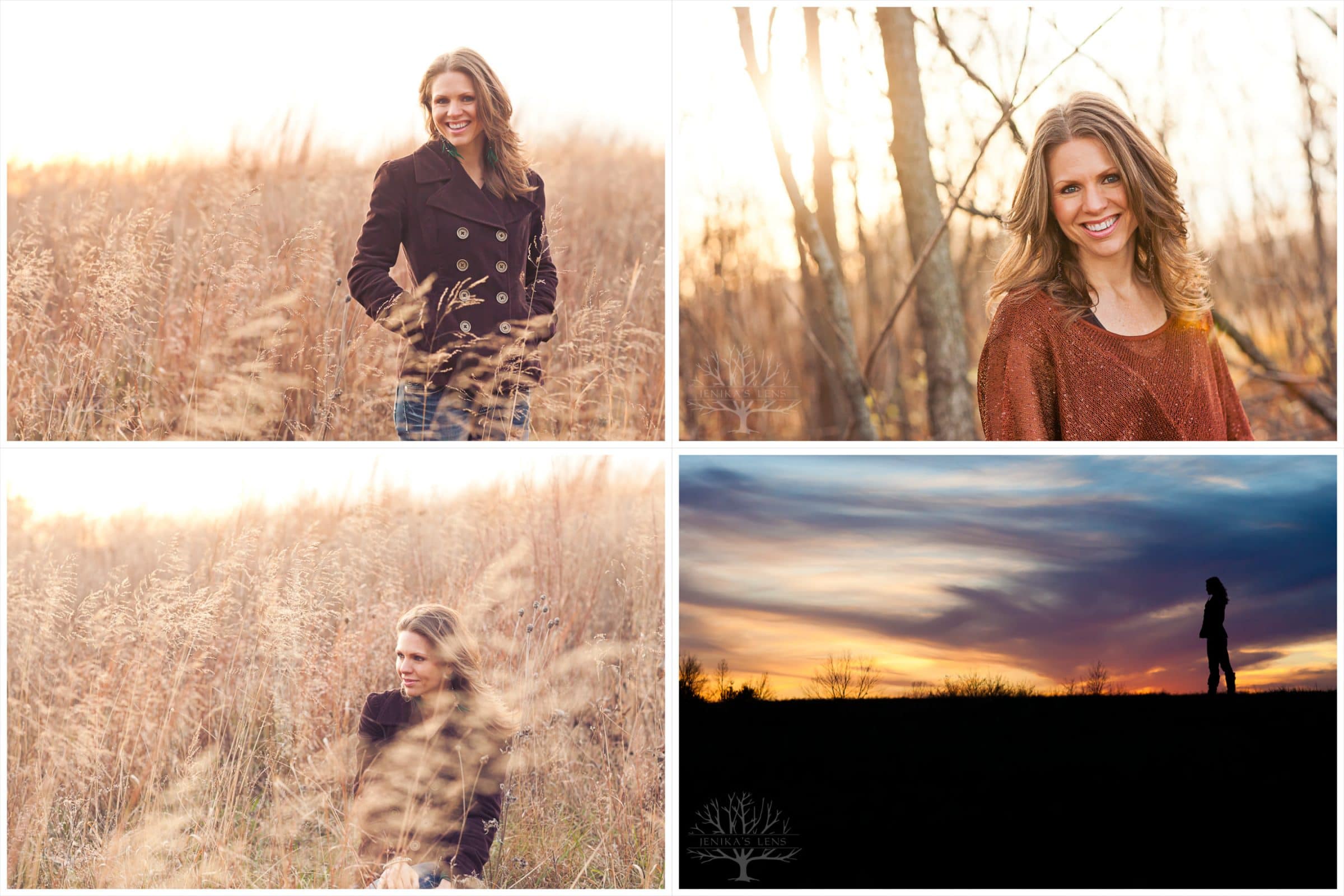
You don’t just want WITHIN-IMAGE contrast, you want BETWEEN-AD contrast as well!
So wherever you can, scope out the competition and consider making yours differ in darkness/lightness, particularly where small images are concerned. Also consider images with strong lines or repetition.
2) Yell “Fire!” in a crowded theater – figuratively speaking.
Our eyes are always scanning for the most important information.
In fact, I bet at least 30% are skipping through this article and reading only the bolded headlines. (It’s cool, that’s why I bold them. Aren’t I nice? 😉 )
But even at a low, automatic level, your visual system skips around looking for the most relevant info.
And the most important information in any scene is most likely to come from the faces of those around you.
Think about it – if a stranger walks up to you, you’re immediately going to need to react differently if they’re smiling vs. snarling.
We want to grasp emotional information, and quickly.
If you show someone a picture and track their eye gaze, their eyes automatically snap to any faces present – specifically the eyes and the corners of the mouth. If the face is highly emotional, it’s like yelling “Fire!” in a crowded theater – everyone will notice and pay attention immediately.
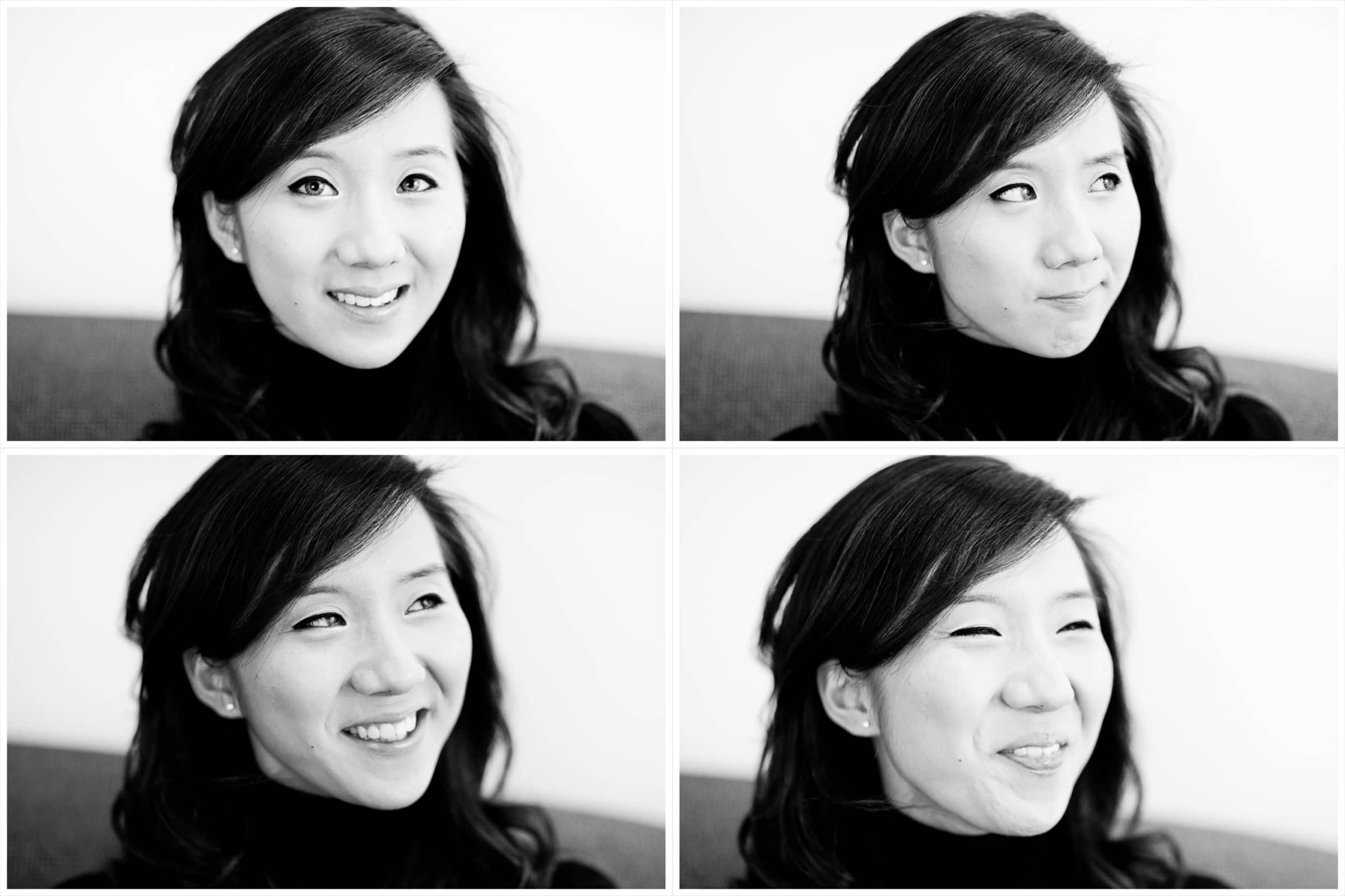
Now, if you have a site or ad situation where everything gets converted to relatively small thumbnails, consider: You might have people in your ad, but can you see the faces?
Because if you have a bunch of small ads with tiny people in them, guess where the viewer’s eye is going to go first?
Yep. The one with the biggest face.

So before you pull the trigger on a fabulous landscape wedding shot for an ad submission- consider: If this is going to be 100×100 pixels in someone’s sidebar, are people going to see it as quickly as they do a face?
I’m not saying the face is the answer 100% of the time. If everyone else is showing colorful close-ups of faces, then having a black and white image with lots of negative space may stand out instead (see #1).
But if everyone is showing wedding shoes, showing a tear sliding down a happy bride’s cheek may well get you more clicks in a sidebar.
Something to mull over.
3) Relevant + Unexpected = Eyeballs.
Imagine you walk into your kitchen and you see a fire hydrant on the counter. It’d catch your attention, right?
The quirky and unexpected tend to get us to pay attention.
Surprise is an attention-getting and memorable event, because it forces your mind to reshape expectations and beliefs about the world.
But back to the fire hydrant on the counter for a second. What if you had just cut your hand in the yard, and were passing through the kitchen on your way to the bathroom in a desperate dash for the first-aid kit?
There’s a good chance you’d breeze right by the fire hydrant – even as odd or out of place as it was. Your attention was already pressed into service elsewhere. (The famous Invisible Gorilla experiment illustrates this idea in a much funnier way.)
There’s a fine balance to strike in what gets our attention.
It needs to be surprising, but somewhat relevant to the task at hand.
If someone is on a wedding site, and sees a sidebar with a bunch of lovely wedding photos in the ads, their attention is probably directed towards “weddings.”
Now, what if you put your own ad in there – with a picture of a dog instead of a couple?

It is entirely possible that the potential client could ignore it entirely, because it seems irrelevant to the task on their mind (weddings! rings!! couples in love!!!). The person may disregard it as irrelevant to their visual search.
If, however, you could still make the dog relevant (e.g. a dog carrying a ring down the aisle), then that image might call much more attention to it. It still belongs to the mental category “weddings,” but it’ll stand out from the rest.
This is not to say that all wedding photographers need to start putting up pictures of dogs. (Though if you did – you’d probably start attracting a lot of pet lover couples.) It’s just an example.
The point is: A standout image is often the one that is almost expected, but has some element to it that makes you pause and say “wait……what?”
Use it to your advantage.
There are times when other concerns override these three fundamentals, sure.
There is no one-size-fits-all rule for ads – and if there were, everyone would be using it, and the person who didn’t follow that rule would end up winning because they’d be different (see how contrast and surprise work?).
And frankly, pure attention is not your only goal. A photo of a gun or a screaming person will get the fastest attention (salient danger, negative emotion), but it may not get someone to want to hire you. But having these guidelines in the back of your head can nudge you in an attention-getting direction when all other factors seem equal.
There are many things at play, so it’s always worth playing around, trying multiple things, and split testing to see what gets the most clicks.
But in general, when faced with decisions about which photo to run, if you pick one that contrasts with itself and with the surroundings, shows faces or emotion, and is slightly surprising without being irrelevant to the task at hand – you probably have a better chance of catching someone’s attention.



Jenika, yours is the only blog that never gets skimmed by me! Always an interesting perspective. Thanks for the ideas!
Thanks for this incredibly helpful article. I’ve just taken your advice and done a critical review of my profile pictures as compared to other photographers on wedding websites, and (needless to say) I had some work to do. My new photos definitely stand out about the competition. Thanks!
Great info! Perfect timing for my New Year promotional ads. Appreciate your advice as always!
I love how you can work in headlines like:
Gulp. Crap. There’s always a snag.
Well said, without being distracting. It’s exactly what goes through people’s minds when faced with a dilemma — and interesting that my shifting gaze settled upon these words.
Some folks use automatic features of website software which substitutes a photo from a list of photos each time the page is rendered. Your words help us see that the list of photos from which one is selected should have the elements you discuss considered when putting them in the list of candidates.
Good stuff, Jenika.
Sweet!
Great points! Well written as well, I certainly didn’t skim through the article! Thanks so much for the info 🙂
This is like finding a pot of gold at the end of a rainbow. Brilliant, Shiny and just what I need at the moment! 😉
So helpful — Thank you so much for taking the time to write this article!
Susan
What an awesome article. I like how you laid out the points in a clear way to make it able to implement on my next ad. I am also going to look over some of my old ads to see how I can improve them. Great point to about removing the emotional/personal connection for an image.
Megan DiPiero – Great info! Perfect timing for my New Year promotional ads
Choosing photos for ads can be such a difficult task, and I am glad you provide such valuable advice. Thank you for these amazing tips!
This is some really great advice. I always have a difficult time for choosing my images! Thank you for sharing.
Love the article, will totally use all these tips to post the right image.